Subscribe to the free insight emails
join newsletter

hello@nikola.design
Belgrade, Serbia
Zero defaults. © 2026

June 24, 2026
Here's where you're losing people if building an insurance comparison tool

If you're building an insurance comparison tool, you might think it's a simple one—a questionnaire and the quotes at the end. But there's actually a disconnect inside. Your job is to make people understand and feel confident making decisions about complex stuff they genuinely are not into.
The gap between visitors and the platform is that people are coming to the site to find the most convenient option for insuring something they care about and the only page they're interested in is the one with the results. And for the person who's building, the focus is on gathering the data, because to show them proper results you need to collect enough information.
Because users could perceive filling out the forms as a waste of time, or they could be suspicious about data safety and so on. So if you want to offer them a service they'll value, it's vitally important to include this perspective in every aspect of the product you're building. Otherwise you may lose them and they're gone to your competitor.
When I started working with a Finnish client on their full comparison tool—home, life, travel, the works—their car insurance version was already live. And going through it, and doing a competitive analysis, made it pretty clear what opportunities most companies in this space are missing:
Make people trust you
- Make the whole website more trustworthy and you'll improve the percentage of people who finish the wizard
Make it easy to consume
- Remove all the clutter
Make it understandable
- Translate insurance language into human
Save them time
- Make the questionnaire as short as possible
Tell them how long it will take
- Highlight the main steps
The bigger picture
- Bit by bit
Make people trust you
Use the whole website to put more clarity around your business
Explain how the site works, how you make money. Present yourself and your industry background, who else is part of the team, provide contact information and social networks so they can see you're real.
If the service is free for users—make it obvious.
Are there people who already trust you? Show reviews from Trustpilot, Google, or App Store ratings. Show tweets or social media mentions of your service.
Feature insurance companies already working with you in a trust bar. Are there any well-known media outlets that recommended or mentioned you? Did you receive any awards or recognition? Are there certificates or security badges you have?
Show that users' data is safe with you. Explain that you're asking only for the information insurance companies need, and that the purpose is providing better service.
Write helpful articles that people will appreciate and find useful. Don't write fake blog posts just for the sake of Google, because if they only attract visitors to your website and people come and see a bunch of AI-generated posts—not only will they not read them, but they'll lose trust in you and you won't turn them into customers.
So give them tips about the best ways to save money, some lesser-known things about certain types of insurance people never pay attention to, the most common mistakes people make when buying home insurance, etc.
Make it easy to consume
People appreciate simplicity over complexity
If the page looks light with clear hierarchy, it'll be easier to grasp and take less time, and the whole visual design should lead users toward finishing it.
Maybe your user is in a hurry, sitting on the subway and keeping an eye on the station where she needs to get off, or coming back from her lunch break holding a hot coffee in one hand while going through the questions.
Embrace negative space and let the elements breathe. People will scan it at a glance and then read later, so you don't want to frighten them with the number of input fields or the amount of text. Instead, spread them throughout the pages.
Keep sections and sentences short. If there's a need for longer text or additional explanations, show a short description below the question and hide the rest behind a tooltip.
Strip the page down — remove what's not necessary to reduce cognitive load. The fewer elements you put, the less likely their eyes will wander off, so they'll focus on their main task. And the fewer clickable elements, the better. It's less likely they'll accidentally leave. Or find themselves in the middle of it thinking: Oh, do they offer a Bundle option? Let me quickly check… They click to the homepage, the notification pops-up and they're gone.
The button that takes them to the next page should of course be primary, but "Back" should not only be secondary, it should also be minimized. On desktop you can put it far left to avoid any unintentional clicking.
Remove the standard global navigation and replace it with a minimal version of the header and footer, keeping only the logo. And the logo could also be non-clickable — depending on how hard you want to push them to the end.
If you have some potentially confusing questions, you can offer a chat or other contact option. Though I can't really imagine someone calling support in the middle of a questionnaire.
For legal and compliance reasons you'll probably want to keep essential information in the footer, such as Terms of Use, Privacy Policy, etc.
Add microinteractions on buttons and forms, or minimal animations when switching between pages, so it looks seamless. If it looks easy to finish, you'll significantly increase the chances that the ones who start will make it to the end.
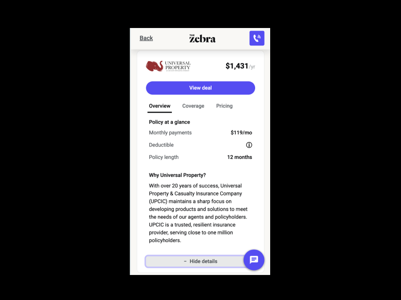
When they land on the results page, don't show them everything in the offer cards. Show only enough info for people to quickly compare the different options. You can show a summary first and then expand the card to hit them with the details.
For example, The Zebra uses separate tabs for Overview, Coverage, and Pricing, which works pretty well since it minimizes cognitive load.
Some multilingual platforms also offer a language toggle inside the wizard, and I'd argue whether it should be there at all. It doesn't make sense that halfway through the questionnaire I'd want to switch languages. The first page is most probably the last point where I'd want to do it.
All of this is especially important on mobile, where the vast majority of traffic is going anyway.
Make it understandable
After your colleague—the insurance expert—finishes writing the questions, take it from there and translate them into plain human language.
Because if you let him do the whole job by himself, you'll leave people puzzled with insurance jargon, and they might run to a competitor rather than look for an explanation.
For example, I'm pretty sure deductibles are a no-brainer for any insurance professional, but for me, someone who buys car insurance once a year, I can easily get rattled trying to figure out whether the deductible is the amount I pay monthly, or something deducted from a payout, or what in the world it's even about.
If some things still need a longer explanation, use tooltips.
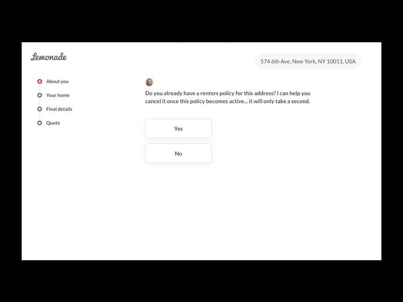
Lemonade does a great job with copy. Although the questions aren't really short, they use everyday language that's understandable to their average customer. And by putting the consultant's name and photo at the start, the whole questionnaire feels more like a conversation you'd have with a friend—natural and frictionless.
Save them time
Time plays an important role
Start with the first input field, e.g., ZIP code, right there on the homepage. And make the "Get a Quote" button clickable regardless of whether the text field is filled in. If they enter their ZIP code, the city name on the next screen could also be prefilled—it's a quick, small favor for the user, but it gives them momentum. Once they've started, they'll have a harder time giving up.
One point that's really important to pay attention to comes later, and it's the scraping - pulling quotes from insurance providers in real time. Since that will definitely take some time, you'd better manage users' expectations.
If some questions help narrow down the search results but aren't mandatory for initiating the search itself, you can move them out of the questionnaire and show them as filters on the results page.
The second option is to start the search in the background the moment they finish the required questions, then let them finish the optional ones while you do your magic—without them being aware of it. Once they hit their final answer, tell them you're working on getting their results so they don't think the site is down. You can do this with a progress bar or a smooth animation. If you go with the latter, use that moment to show users what's happening behind the scenes, so they see the benefit of it.
These tactics don't really make the process shorter, but they'll affect users' subjective sense of time.
On the screen where you're showing quotes, in case the user had to go through many pages, you can add an Edit button so they can update their answers and get another quote without starting all over again.
Also, on this final page you can put upsell options instead of adding them to the questionnaire and making it longer.
And last but not least, never underestimate the power of the status quo, so better double-check with your team whether you can cut some things out to make the wizard shorter.
Tell them how long it will take
People are impatient, and it's always good to give them a heads-up on time
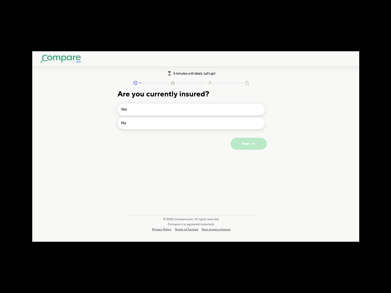
If your questionnaire is short and it only takes a few minutes to fill it out, show it to them upfront, they'll be much more likely to start the process.
And if it takes a bit longer, display a progress indicator or a stepper as soon as they start. No need to show every step, because you don't want to scare them with 27 questions. Instead, group them into 2-3-4 main categories and show only those. This will give them a clear overview of how much is left, what to expect, and where they currently are in the process, so they feel guided and confident that everything is under control.
Other compelling ways to save users' time are the ones I mentioned above: using plain language, asking straightforward questions, and removing ambiguity.
The bigger picture
All the stuff above are like building blocks and each one can bit by bit make your product better and help more people.
Although I was talking about insurance, I'd guess it's pretty similar for any comparison tool in any other industry. Test one thing at a time. See on which page the most people are dropping off. Then play around with reordering the pages. Try reaching out to users who abandoned and talk to them.
This type of wizard is actually the inverse of something you already know well—the checkout process on e-commerce websites. There you go through the different options and then, once you've decided to purchase, you enter a lean and straightforward funnel until you're done. Here you start with the wizard and leave with the options.


Subscribe to the free insight emails
join newsletter

Belgrade, Serbia
Zero defaults. © 2026
June 24, 2026
Here's where you're losing people if building an insurance comparison tool
If you're building an insurance comparison tool, you might think it's a simple one—a questionnaire and the quotes at the end. But there's actually a disconnect inside. Your job is to make people understand and feel confident making decisions about complex stuff they genuinely are not into.
The gap between visitors and the platform is that people are coming to the site to find the most convenient option for insuring something they care about and the only page they're interested in is the one with the results. And for the person who's building, the focus is on gathering the data, because to show them proper results you need to collect enough information.
Because users could perceive filling out the forms as a waste of time, or they could be suspicious about data safety and so on. So if you want to offer them a service they'll value, it's vitally important to include this perspective in every aspect of the product you're building. Otherwise you may lose them and they're gone to your competitor.
When I started working with a Finnish client on their full comparison tool—home, life, travel, the works—their car insurance version was already live. And going through it, and doing a competitive analysis, made it pretty clear what opportunities most companies in this space are missing:
Make people trust you
- Make the whole website more trustworthy and you'll improve the percentage of people who finish the wizard
Make it easy to consume
- Remove all the clutter
Make it understandable
- Translate insurance language into human
Save them time
- Make the questionnaire as short as possible
Tell them how long it will take
- Highlight the main steps
The bigger picture
- Bit by bit
Make people trust you
Use the whole website to put more clarity around your business
Explain how the site works, how you make money. Present yourself and your industry background, who else is part of the team, provide contact information and social networks so they can see you're real.
If the service is free for users—make it obvious.
Are there people who already trust you? Show reviews from Trustpilot, Google, or App Store ratings. Show tweets or social media mentions of your service.
Feature insurance companies already working with you in a trust bar. Are there any well-known media outlets that recommended or mentioned you? Did you receive any awards or recognition? Are there certificates or security badges you have?
Show that users' data is safe with you. Explain that you're asking only for the information insurance companies need, and that the purpose is providing better service.
Write helpful articles that people will appreciate and find useful. Don't write fake blog posts just for the sake of Google, because if they only attract visitors to your website and people come and see a bunch of AI-generated posts—not only will they not read them, but they'll lose trust in you and you won't turn them into customers.
So give them tips about the best ways to save money, some lesser-known things about certain types of insurance people never pay attention to, the most common mistakes people make when buying home insurance, etc.
Make it easy to consume
People appreciate simplicity over complexity
If the page looks light with clear hierarchy, it'll be easier to grasp and take less time, and the whole visual design should lead users toward finishing it.
Maybe your user is in a hurry, sitting on the subway and keeping an eye on the station where she needs to get off, or coming back from her lunch break holding a hot coffee in one hand while going through the questions.
Embrace negative space and let the elements breathe. People will scan it at a glance and then read later, so you don't want to frighten them with the number of input fields or the amount of text. Instead, spread them throughout the pages.
Keep sections and sentences short. If there's a need for longer text or additional explanations, show a short description below the question and hide the rest behind a tooltip.
Strip the page down — remove what's not necessary to reduce cognitive load. The fewer elements you put, the less likely their eyes will wander off, so they'll focus on their main task. And the fewer clickable elements, the better. It's less likely they'll accidentally leave. Or find themselves in the middle of it thinking: Oh, do they offer a Bundle option? Let me quickly check… They click to the homepage, the notification pops-up and they're gone.
The button that takes them to the next page should of course be primary, but "Back" should not only be secondary, it should also be minimized. On desktop you can put it far left to avoid any unintentional clicking.
Remove the standard global navigation and replace it with a minimal version of the header and footer, keeping only the logo. And the logo could also be non-clickable — depending on how hard you want to push them to the end.
If you have some potentially confusing questions, you can offer a chat or other contact option. Though I can't really imagine someone calling support in the middle of a questionnaire.
For legal and compliance reasons you'll probably want to keep essential information in the footer, such as Terms of Use, Privacy Policy, etc.
Add microinteractions on buttons and forms, or minimal animations when switching between pages, so it looks seamless. If it looks easy to finish, you'll significantly increase the chances that the ones who start will make it to the end.
When they land on the results page, don't show them everything in the offer cards. Show only enough info for people to quickly compare the different options. You can show a summary first and then expand the card to hit them with the details.
For example, The Zebra uses separate tabs for Overview, Coverage, and Pricing, which works pretty well since it minimizes cognitive load.
Some multilingual platforms also offer a language toggle inside the wizard, and I'd argue whether it should be there at all. It doesn't make sense that halfway through the questionnaire I'd want to switch languages. The first page is most probably the last point where I'd want to do it.
All of this is especially important on mobile, where the vast majority of traffic is going anyway.
Make it understandable
After your colleague—the insurance expert—finishes writing the questions, take it from there and translate them into plain human language.
Because if you let him do the whole job by himself, you'll leave people puzzled with insurance jargon, and they might run to a competitor rather than look for an explanation.
For example, I'm pretty sure deductibles are a no-brainer for any insurance professional, but for me, someone who buys car insurance once a year, I can easily get rattled trying to figure out whether the deductible is the amount I pay monthly, or something deducted from a payout, or what in the world it's even about.
If some things still need a longer explanation, use tooltips.
Lemonade does a great job with copy. Although the questions aren't really short, they use everyday language that's understandable to their average customer. And by putting the consultant's name and photo at the start, the whole questionnaire feels more like a conversation you'd have with a friend—natural and frictionless.
Save them time
Time plays an important role
Start with the first input field, e.g., ZIP code, right there on the homepage. And make the "Get a Quote" button clickable regardless of whether the text field is filled in. If they enter their ZIP code, the city name on the next screen could also be prefilled—it's a quick, small favor for the user, but it gives them momentum. Once they've started, they'll have a harder time giving up.
One point that's really important to pay attention to comes later, and it's the scraping - pulling quotes from insurance providers in real time. Since that will definitely take some time, you'd better manage users' expectations.
If some questions help narrow down the search results but aren't mandatory for initiating the search itself, you can move them out of the questionnaire and show them as filters on the results page.
The second option is to start the search in the background the moment they finish the required questions, then let them finish the optional ones while you do your magic—without them being aware of it. Once they hit their final answer, tell them you're working on getting their results so they don't think the site is down. You can do this with a progress bar or a smooth animation. If you go with the latter, use that moment to show users what's happening behind the scenes, so they see the benefit of it.
These tactics don't really make the process shorter, but they'll affect users' subjective sense of time.
On the screen where you're showing quotes, in case the user had to go through many pages, you can add an Edit button so they can update their answers and get another quote without starting all over again.
Also, on this final page you can put upsell options instead of adding them to the questionnaire and making it longer.
And last but not least, never underestimate the power of the status quo, so better double-check with your team whether you can cut some things out to make the wizard shorter.
Tell them how long it will take
People are impatient, and it's always good to give them a heads-up on time
If your questionnaire is short and it only takes a few minutes to fill it out, show it to them upfront, they'll be much more likely to start the process.
And if it takes a bit longer, display a progress indicator or a stepper as soon as they start. No need to show every step, because you don't want to scare them with 27 questions. Instead, group them into 2-3-4 main categories and show only those. This will give them a clear overview of how much is left, what to expect, and where they currently are in the process, so they feel guided and confident that everything is under control.
Other compelling ways to save users' time are the ones I mentioned above: using plain language, asking straightforward questions, and removing ambiguity.
The bigger picture
All the stuff above are like building blocks and each one can bit by bit make your product better and help more people.
Although I was talking about insurance, I'd guess it's pretty similar for any comparison tool in any other industry. Test one thing at a time. See on which page the most people are dropping off. Then play around with reordering the pages. Try reaching out to users who abandoned and talk to them.
This type of wizard is actually the inverse of something you already know well—the checkout process on e-commerce websites. There you go through the different options and then, once you've decided to purchase, you enter a lean and straightforward funnel until you're done. Here you start with the wizard and leave with the options.
Subscribe to the free insight emails
join newsletter
Belgrade, Serbia
Zero defaults. © 2026
June 24, 2026
Here's where you're losing people if building an insurance comparison tool
If you're building an insurance comparison tool, you might think it's a simple one—a questionnaire and the quotes at the end. But there's actually a disconnect inside. Your job is to make people understand and feel confident making decisions about complex stuff they genuinely are not into.
The gap between visitors and the platform is that people are coming to the site to find the most convenient option for insuring something they care about and the only page they're interested in is the one with the results. And for the person who's building, the focus is on gathering the data, because to show them proper results you need to collect enough information.
Because users could perceive filling out the forms as a waste of time, or they could be suspicious about data safety and so on. So if you want to offer them a service they'll value, it's vitally important to include this perspective in every aspect of the product you're building. Otherwise you may lose them and they're gone to your competitor.
When I started working with a Finnish client on their full comparison tool—home, life, travel, the works—their car insurance version was already live. And going through it, and doing a competitive analysis, made it pretty clear what opportunities most companies in this space are missing:
Make people trust you
- Make the whole website more trustworthy and you'll improve the percentage of people who finish the wizard
Make it easy to consume
- Remove all the clutter
Make it understandable
- Translate insurance language into human
Save them time
- Make the questionnaire as short as possible
Tell them how long it will take
- Highlight the main steps
The bigger picture
- Bit by bit
Make people trust you
Use the whole website to put more clarity around your business
Explain how the site works, how you make money. Present yourself and your industry background, who else is part of the team, provide contact information and social networks so they can see you're real.
If the service is free for users—make it obvious.
Are there people who already trust you? Show reviews from Trustpilot, Google, or App Store ratings. Show tweets or social media mentions of your service.
Feature insurance companies already working with you in a trust bar. Are there any well-known media outlets that recommended or mentioned you? Did you receive any awards or recognition? Are there certificates or security badges you have?
Show that users' data is safe with you. Explain that you're asking only for the information insurance companies need, and that the purpose is providing better service.
Write helpful articles that people will appreciate and find useful. Don't write fake blog posts just for the sake of Google, because if they only attract visitors to your website and people come and see a bunch of AI-generated posts—not only will they not read them, but they'll lose trust in you and you won't turn them into customers.
So give them tips about the best ways to save money, some lesser-known things about certain types of insurance people never pay attention to, the most common mistakes people make when buying home insurance, etc.
Make it easy to consume
People appreciate simplicity over complexity
If the page looks light with clear hierarchy, it'll be easier to grasp and take less time, and the whole visual design should lead users toward finishing it.
Maybe your user is in a hurry, sitting on the subway and keeping an eye on the station where she needs to get off, or coming back from her lunch break holding a hot coffee in one hand while going through the questions.
Embrace negative space and let the elements breathe. People will scan it at a glance and then read later, so you don't want to frighten them with the number of input fields or the amount of text. Instead, spread them throughout the pages.
Keep sections and sentences short. If there's a need for longer text or additional explanations, show a short description below the question and hide the rest behind a tooltip.
Strip the page down — remove what's not necessary to reduce cognitive load. The fewer elements you put, the less likely their eyes will wander off, so they'll focus on their main task. And the fewer clickable elements, the better. It's less likely they'll accidentally leave. Or find themselves in the middle of it thinking: Oh, do they offer a Bundle option? Let me quickly check… They click to the homepage, the notification pops-up and they're gone.
The button that takes them to the next page should of course be primary, but "Back" should not only be secondary, it should also be minimized. On desktop you can put it far left to avoid any unintentional clicking.
Remove the standard global navigation and replace it with a minimal version of the header and footer, keeping only the logo. And the logo could also be non-clickable — depending on how hard you want to push them to the end.
If you have some potentially confusing questions, you can offer a chat or other contact option. Though I can't really imagine someone calling support in the middle of a questionnaire.
For legal and compliance reasons you'll probably want to keep essential information in the footer, such as Terms of Use, Privacy Policy, etc.
Add microinteractions on buttons and forms, or minimal animations when switching between pages, so it looks seamless. If it looks easy to finish, you'll significantly increase the chances that the ones who start will make it to the end.
When they land on the results page, don't show them everything in the offer cards. Show only enough info for people to quickly compare the different options. You can show a summary first and then expand the card to hit them with the details.
For example, The Zebra uses separate tabs for Overview, Coverage, and Pricing, which works pretty well since it minimizes cognitive load.
Some multilingual platforms also offer a language toggle inside the wizard, and I'd argue whether it should be there at all. It doesn't make sense that halfway through the questionnaire I'd want to switch languages. The first page is most probably the last point where I'd want to do it.
All of this is especially important on mobile, where the vast majority of traffic is going anyway.
Make it understandable
After your colleague—the insurance expert—finishes writing the questions, take it from there and translate them into plain human language.
Because if you let him do the whole job by himself, you'll leave people puzzled with insurance jargon, and they might run to a competitor rather than look for an explanation.
For example, I'm pretty sure deductibles are a no-brainer for any insurance professional, but for me, someone who buys car insurance once a year, I can easily get rattled trying to figure out whether the deductible is the amount I pay monthly, or something deducted from a payout, or what in the world it's even about.
If some things still need a longer explanation, use tooltips.
Lemonade does a great job with copy. Although the questions aren't really short, they use everyday language that's understandable to their average customer. And by putting the consultant's name and photo at the start, the whole questionnaire feels more like a conversation you'd have with a friend—natural and frictionless.
Save them time
Time plays an important role
Start with the first input field, e.g., ZIP code, right there on the homepage. And make the "Get a Quote" button clickable regardless of whether the text field is filled in. If they enter their ZIP code, the city name on the next screen could also be prefilled—it's a quick, small favor for the user, but it gives them momentum. Once they've started, they'll have a harder time giving up.
One point that's really important to pay attention to comes later, and it's the scraping - pulling quotes from insurance providers in real time. Since that will definitely take some time, you'd better manage users' expectations.
If some questions help narrow down the search results but aren't mandatory for initiating the search itself, you can move them out of the questionnaire and show them as filters on the results page.
The second option is to start the search in the background the moment they finish the required questions, then let them finish the optional ones while you do your magic—without them being aware of it. Once they hit their final answer, tell them you're working on getting their results so they don't think the site is down. You can do this with a progress bar or a smooth animation. If you go with the latter, use that moment to show users what's happening behind the scenes, so they see the benefit of it.
These tactics don't really make the process shorter, but they'll affect users' subjective sense of time.
On the screen where you're showing quotes, in case the user had to go through many pages, you can add an Edit button so they can update their answers and get another quote without starting all over again.
Also, on this final page you can put upsell options instead of adding them to the questionnaire and making it longer.
And last but not least, never underestimate the power of the status quo, so better double-check with your team whether you can cut some things out to make the wizard shorter.
Tell them how long it will take
People are impatient, and it's always good to give them a heads-up on time
If your questionnaire is short and it only takes a few minutes to fill it out, show it to them upfront, they'll be much more likely to start the process.
And if it takes a bit longer, display a progress indicator or a stepper as soon as they start. No need to show every step, because you don't want to scare them with 27 questions. Instead, group them into 2-3-4 main categories and show only those. This will give them a clear overview of how much is left, what to expect, and where they currently are in the process, so they feel guided and confident that everything is under control.
Other compelling ways to save users' time are the ones I mentioned above: using plain language, asking straightforward questions, and removing ambiguity.
The bigger picture
All the stuff above are like building blocks and each one can bit by bit make your product better and help more people.
Although I was talking about insurance, I'd guess it's pretty similar for any comparison tool in any other industry. Test one thing at a time. See on which page the most people are dropping off. Then play around with reordering the pages. Try reaching out to users who abandoned and talk to them.
This type of wizard is actually the inverse of something you already know well—the checkout process on e-commerce websites. There you go through the different options and then, once you've decided to purchase, you enter a lean and straightforward funnel until you're done. Here you start with the wizard and leave with the options.